Customizing the Heat Map
Every part of the Heat Map is configurable from the top toolbar: how tickers are grouped, what drives box size and color, which markets are included, and what the labels show. This page walks through each control from left to right.
Main and Sub Category
The Main Category decides how the map is grouped. Add a Sub Category to split each group one level further — for example, group by Sectors and split by Industries.
Available categories include:
- Sectors, Industries, and Themes
- Market Capitalization (mega cap to micro cap)
- Market breadth splits — Advancing/Declining, Above/Below the 50-Day or 200-Day MA, and New 20-Day / 26-Week / 52-Week Highs/Lows
- Top Alpha Setups and Alpha Strategy
- Earnings Reported and Earnings Next
- Tight Ranges
- Foreign Countries
Set the Sub Category to None for a single-level map.
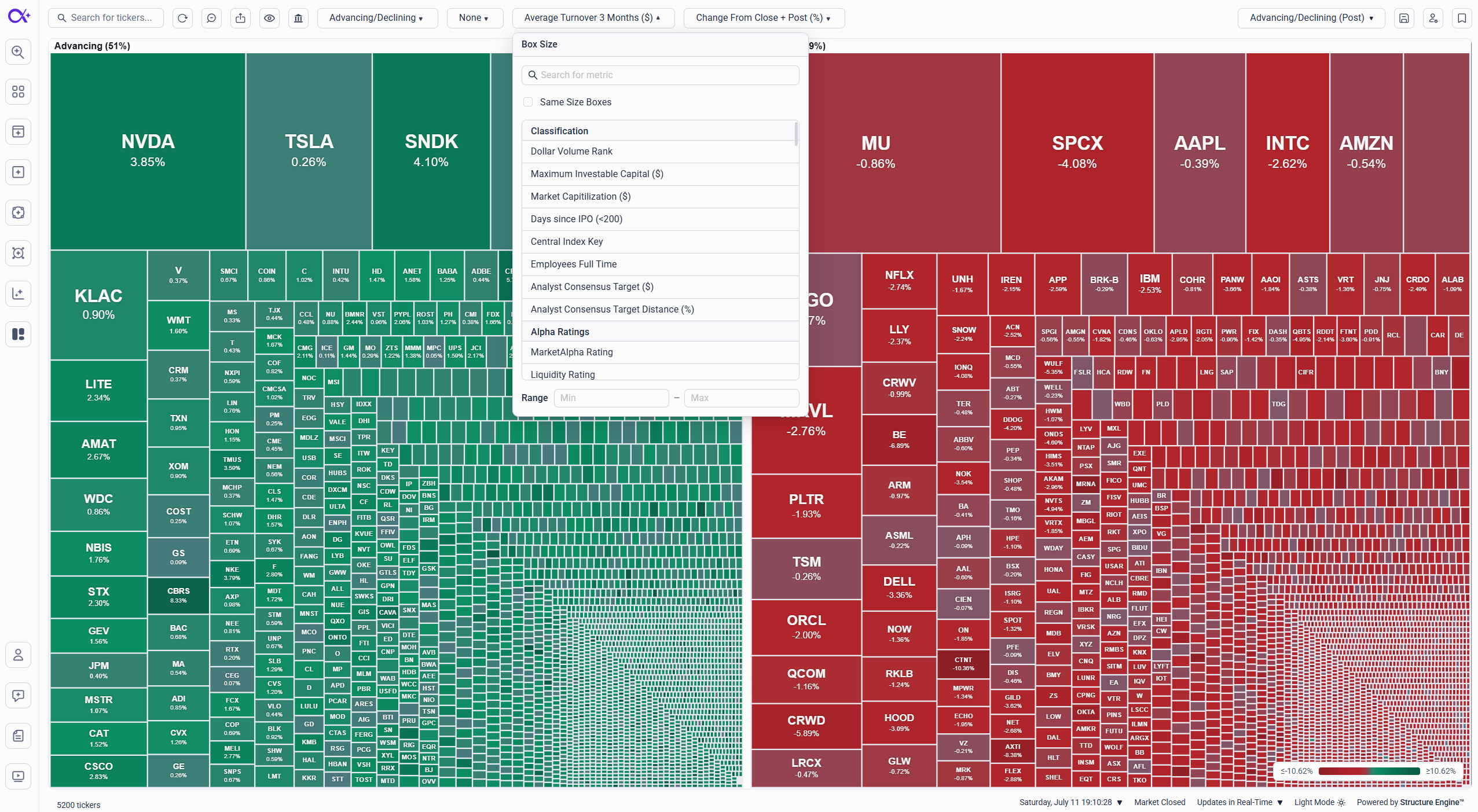
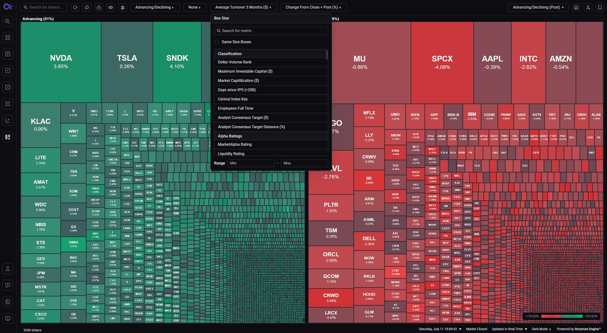
Box Size
Box Size controls how much space each ticker gets — pick any numeric metric, such as market cap, volume, or liquidity. Two extra options live in the same menu:
- Min–Max range — only show tickers whose size metric falls inside the range you set (leave either side empty for an open bound)
- Same Size Boxes — give every ticker an identical box, ideal for breadth views where you want to count tickers rather than weigh them
Same Size Boxes and a Box Size metric are mutually exclusive — choosing one replaces the other.
Box Color
Box Color controls the color scale — typically a performance metric such as daily change, so gainers glow green and decliners red, with stronger moves shown in deeper shades. Like Box Size, it supports a Min–Max range so you can isolate tickers inside a specific band (for example, only moves beyond ±2%).
Markets
Use the Markets menu to choose which parts of the market are included:
- S&P 500
- Nasdaq 100
- Dow Jones 30
- Other Tickers — everything outside the three major indexes
Combine them freely — for example, S&P 500 only for a large-cap view, or Other Tickers only to watch the broader market.
Display Options
The Display menu controls what the group headers and map show:
- Show Ticker Counts — display how many tickers are in each group
- Show Percentage Total — display each group's share of the visible map
- Show Missing Data — include tickers that have no value for the current size or color metric (hidden by default)
Saving Your Setup
Everything you configure here — categories, metrics, ranges, markets, and missing-data handling — can be saved as a Heat Map profile so it's one click away next time. See Heat Map Profiles for details.
Summary
Start from a ready-made profile, then adjust the grouping, size, and color metrics until the map answers your question — market breadth, sector rotation, earnings movers, or anything in between. Ranges and market filters let you cut the noise, and profiles make every view repeatable.